
Supercharged conference note-taking with Notion
Like genomes, notes evolve: A tale of adaptive documentation

I’ve loved the productivity app Notion for a few years. Before, I used org-mode in Emacs and loved the plain-textiness, but wanted more integrations and didn’t want to write ELisp code every time I wanted to change something. My Notion setup is inspired by August & Jane Bradley’s Life Operating System and Marie Poulin’s & Ben Borowski’s Notion Mastery work.
At the Plant and Animal Genomes conference (see our recap), I had six days of note-taking to perfect my Notion templates. Let’s dive in!
Iterated on the best way to take notes for an external talk
I love taking detailed notes to pay attention and retain information from the talk. I’m a visual person, so having the slide pictures is immensely useful if I can get them. I’m the annoying one in front of you at the conference taking pictures of every slide.
For this conference, I set PAG32 as a project and added pages to the related “Meetings” database, using the “External Talk” template. See below for the full PAG32 project page and all relations.

Initially, the template was simple, but it became more powerful by Day 6. I refined on my note-taking style throughout the conference, taking dozens of notes to figure out the best method for me. This was a good reminder that nothing is “perfect” the first time, but taking action will help you understand what is or isn’t useful.
Initially, I just did notes and a picture
The simplest way to take notes was to use slide headers, add bullet points for the text, and a picture below. It was simple and it worked.

Switched to 2-column view
On Day 3, I realized the slide pictures took up a lot of vertical space. So, I started using the two-column arrangement in Notion for side-by-side annotations. To make it easy, I made a Notion Button (below).

The button was easy to use, and took up less vertical space, which was my goal! Here’s an example of slide note-taking:
This was nice, but because Notion is organized by “blocks” and the title, notes, and picture were in different “blocks,” it was difficult to reorder the slides if I mixed up the order while taking notes during speedy talks. In Notion, I could make a single block as a toggle or as a callout. Toggles hide extraneous information, but I wanted to see the photos and notes for each slide. Callouts keep the nested blocks together and add nice subtle visual box around the content. Here, I think callouts are more useful because the contents are visible in the whole page for easy scanning, while toggles would require clicking to open the notes for each slide.
Switched to callout + two-column view
By Day 5, I chose a callout to keep all photos for one slide in one place (for animations), save space, make each section movable, and let the slide title use the full page width. To get the two-column view in the callout, do some hacky Notion-ing: create a “new page” within that callout, make the two-column layout in this nested page, navigate back to the main page, and turn it into “text.” See this video for a demonstration.

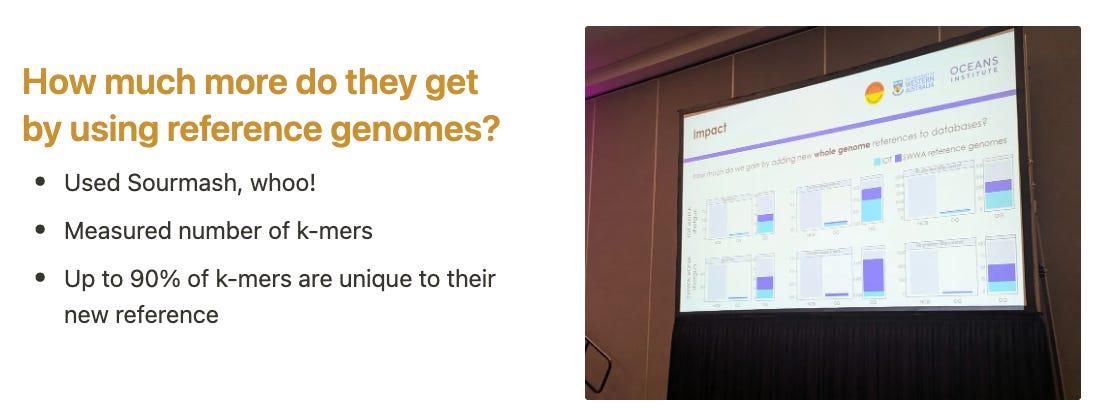
Below is an example section of slide notes, including a couple of slide photos to capture the animations by the presenter.

Hope you enjoyed that deep dive into conference note-taking with Notion. Here’s the Notion template for the final version.
Here’s the gallery from one session! It turned out nicely.

 | A guest post by
|